Analyse Data from User Journeys
The User Journey page has a wealth of data for you to analyse, or to troubleshoot issues with your page. You can use this page to:
- View the Latest and Past Test results.
- Identify Issues on the page.
- Analyse User Journey Failures.
- Analyse the Page Load for each step of your Journey with a built-in Page Load Monitor.
- Make changes using the Script Editor.
Overview and Trending
The Overview and Trending Tab shows you information about your User Journey at a glance.
The Recent Status section gives you a timeline to visualise the test results for your journey over a set period. Click Time Period to view tests over a longer duration of time. You can hover over the bars to see more information.
- Green bars highlight passed tests.
- Amber tests indicate tests with issues (e.g. element errors).
- Red bars indicate failed tests.
- Greyed-out or striped bars indicate time periods when the test was paused, in draft mode or in a maintenance window.
Click on the bars to view the individual test results.
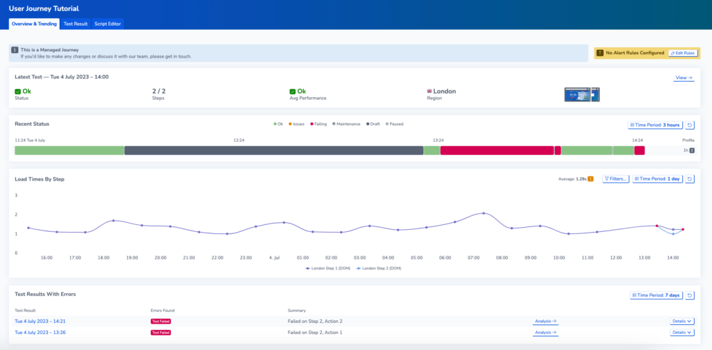
On this page you can access a variety of helpful information, including:
- Latest test result data.
- Load times by step: This graph displays the load times for each step of the test, allowing you to identify any bottlenecks or areas for improvement. You can hover over the graph to see exact timings.
- Test results with errors: At the bottom of the page, you’ll find a list of test results that produced errors. Clicking on an error will take you to the test results.
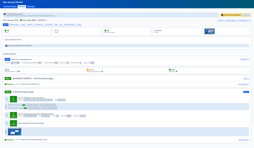
Test Results
The Test Results Page contains in-depth information about the user journey results.
In the Result tab on this page, you can view the latest result or go to Test History to view test results over the last 30 days. You can apply filters to refine these results.
At the top of the page, you can view details on the test status, the number of steps performed, the current page load performance, and the test region. Additionally, you can see screenshots and video recordings of the test (if enabled).
View the User Journey Script to see which steps have passed. There are also metrics to identify any issues with your Journey.
- Total Script Run time: The total execution time of running your journey.
- Avg Run Time Per Step: The average run time for each step in your journey.
- Wait Time: The total idle time caused by Wait actions. As the script is paused for a set period, this does not accurately reflect the experience for users and could indicate a slow site. You can lower the wait time by using a WaitForElement action in your script instead.
View In-Depth Page Load Information within your User Journey
User Journeys contain a built-in Page Load Monitor, enabling you to view Page Load Data for each step of the journey.
For more information about how to interpret this data, you can read more about analysing page load data.
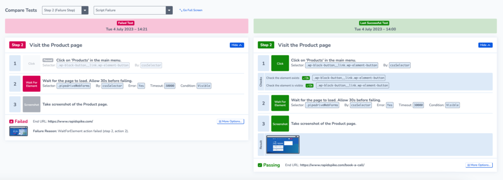
Failure Analysis for User Journeys
On the User Journey test results page, Failure Analysis allows you to compare data from failing and passing test results side by side. This can assist you in identifying the root cause of a journey failure
Failure Analysis for User Journeys uses data from the built-in Page Load Monitor that analyses page load data for every step of the User Journey.
Failure analysis for User Journeys works in much the same way as for Page Load Monitors. You can read that article here for a more in-depth guide.
Unlike Page Load Monitors, User Journeys have some additional features:
- Compare a failing script to a passing one
- On the visual screen, you can compare video recordings if these are enabled for your journey
- Change which steps you want to compare the data for using the drop-down menu.
Script Editor
The Script Editor Page allows you to make changes to the script for your User Journey. You can read an in-depth guide about the Script Editor here.