This week we’ve released another update to the RapidSpike app – one we’d like to share with you here. The change is primarily to the design, look and feel of the app – and one that we think has made a big improvement.
We’re really keen to keep our update release cycle as frequent as possible – our users will see these changes popping up here on the blog and in our app changelog.
A lot of the updates we make on a regular basis are subtle: minor layout tweaks, bug fixes, performance improvements etc. However occasionally we’ll do a major update that greatly affects the look and feel of the app, or adds an entirely new feature.
Updating the app background
The main change this week is to the background throughout the app. This is now white – which has the effect of brightening the app, making things cleaner and fresher.
We’ve made this change for a number of design-related reasons. The main reason is simply because it helps the actual content of the app – stats, graphs, tables etc – stand out better. Obviously the actual Uptime and User Journey statistics are the most important pieces of information on any page and so it’s important to make sure that they are prominent.
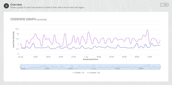
The white design also ties in to some exciting new User Journey stats and graphs that we’re hoping to release soon – watch this space!
The good news is that although we’ve made a major visual update to the app, the actual layout of the pages hasn’t really changed – there’s no need to have to learn a new interface. We have made some subtle changes to the submenus on some pages, but this is just to improve clarity and make it even more obvious what page you’re on.
A new home screen
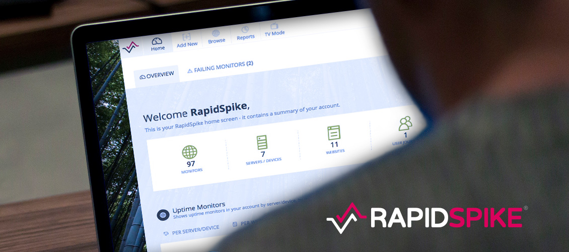
The other major update made this week is to the Home Screen of the app. We’ve long planned to improve this page, and the changes made this week represent just the start of what’s to come.
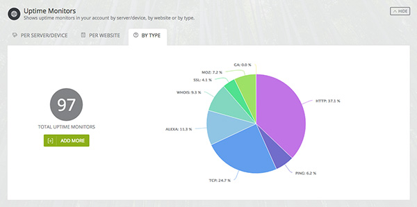
The Home Screen now shows some useful information about monitors on your account, in graph format. This gives you an overview of what servers and websites have monitors and what the status is of those monitors. We’ve also done a breakdown of all monitors in your account by type, so you know what you’ve set up.
Finally, we’ve also added a Tasks section which is designed to highlight parts of the app you may not have configured. When you perform certain actions in the app – such as filling in your account info or making monitors – the system will check off that task.
We hope you like the changes – and that they make using the app an easier and more pleasant experience!