We recently released our new website performance dashboards into the platform. Watch the introduction video with Head of Product, Bryn Dodgson and learn more about the dashboards below.
Headlines
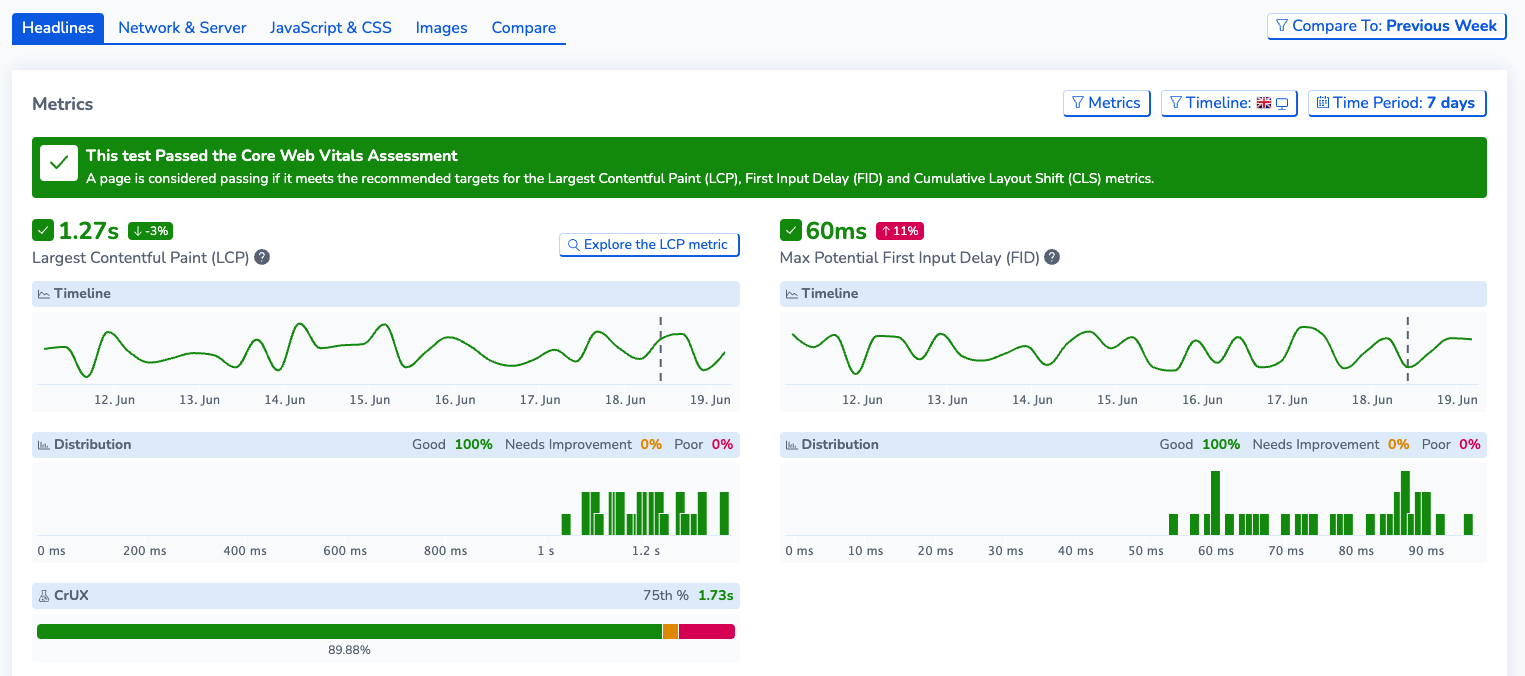
The first dashboard you’ll find in the new performance section, is Headlines. This section gives a top level overview of the Core Web Vitals along with any other Web Vitals metrics that you want to view. The metrics section provides scores for the test you are viewing along with the ability to compare these scores to the previous test, week and month. This is great for teams who want to compare how website improvements have directly impacted web performance over time.
The metrics section contains a timeline and a distribution graphs. The timeline shows the scores for each metric across a given time period and the distribution graph shows how many of each score occurred for the tests in that time period. Each metric has a CrUX graph if there is enough CrUX data available for the page you are viewing the tests for.
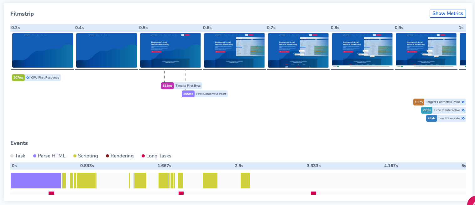
The Headlines view also features a filmstrip and event timeline, the filmstrip displays the breakdown of the page load over time with specific metrics marked on the filmstrip screenshots, so you can see exactly what has loaded at the point of that metric. The events timeline gives you a breakdown of tasks and an insight into any long running tasks with information about which elements took a longer time to load, and the duration of the long task.
Network & Server
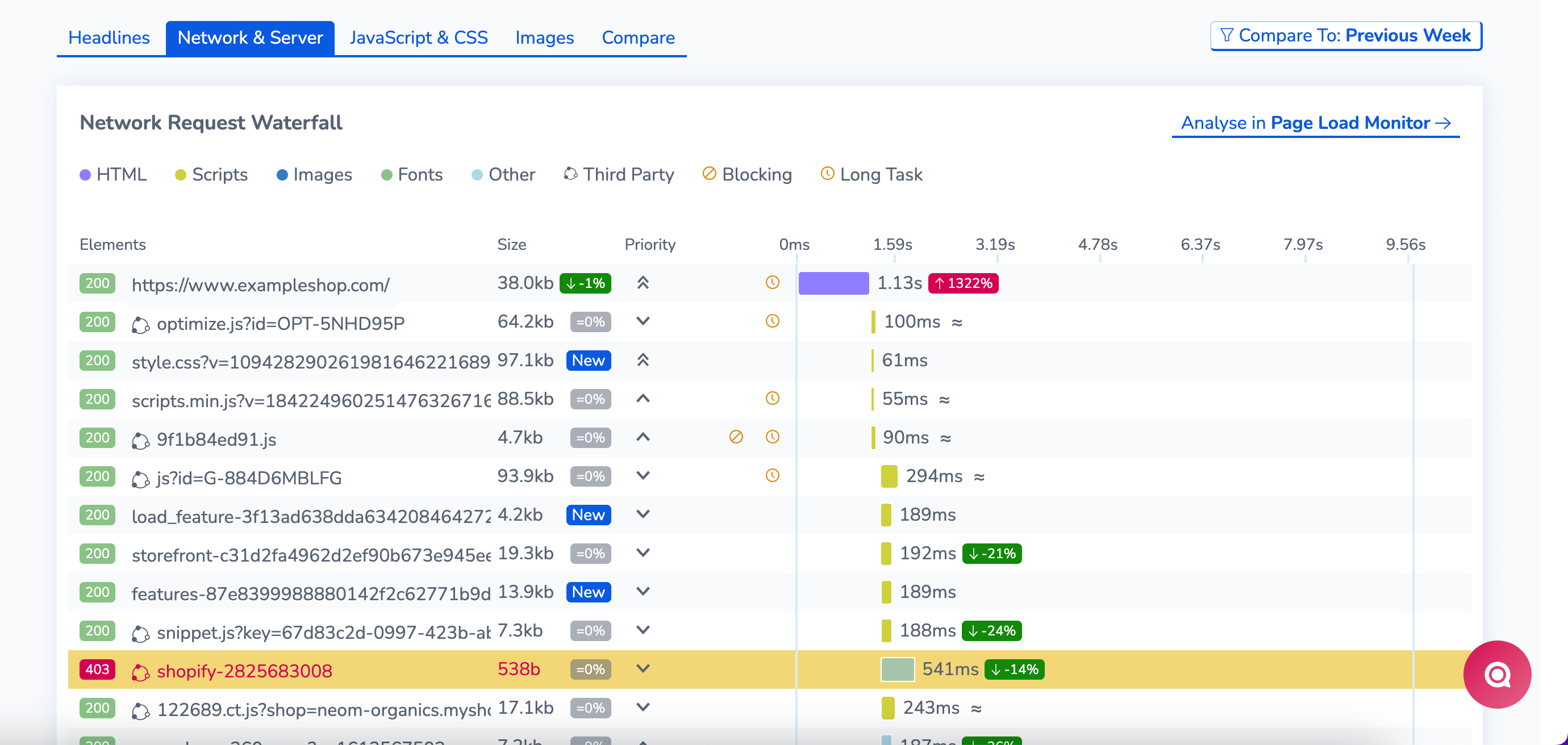
Network & Server contains the following views: Network Request Waterfall, Content Breakdown, Server Response and heaviest Payload.
The waterfall gives a breakdown of each element that is loaded by the page and how long each element takes to complete, if they are a blocking or long task, and also the size and priority of the element. This is a great tool for web performance analytics and can help users quickly identify problem elements.
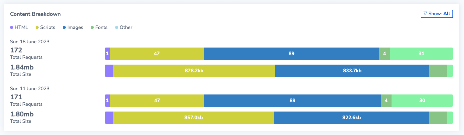
The content breakdown provides all the elements and shows how many of each type of element have loaded, these are HTML, Scripts, Fonts and Images. This breakdown helps to see which types of elements are most common and which ones are largest in terms of size.
Server response gives an overview of the Round Trip Time (RTT) and Latency of each origin, which allows you see which ones might be having an impact on the performance of your page due to slow loading origins like third parties. Additionally, heaviest payloads show which of the elements in the network requests are the largest and could be impacting on performance.
Each of the sections also has compare data, comparing each element to a Previous Test, week or month’s results. Showing the percentage change from the current test to the comparison. We also provide an indicator of which elements are new elements in the test.
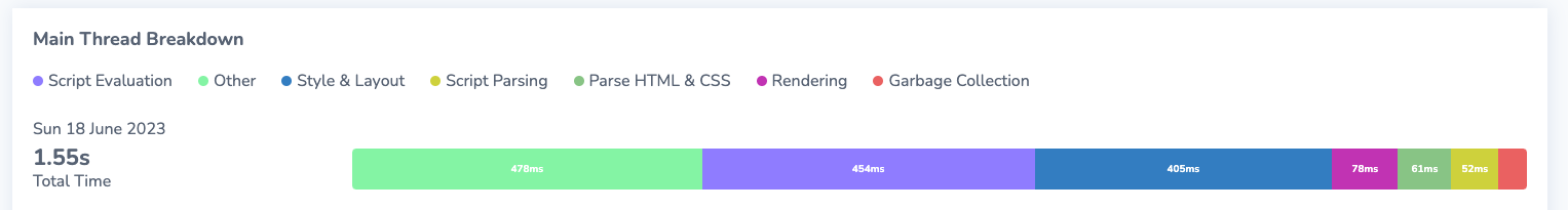
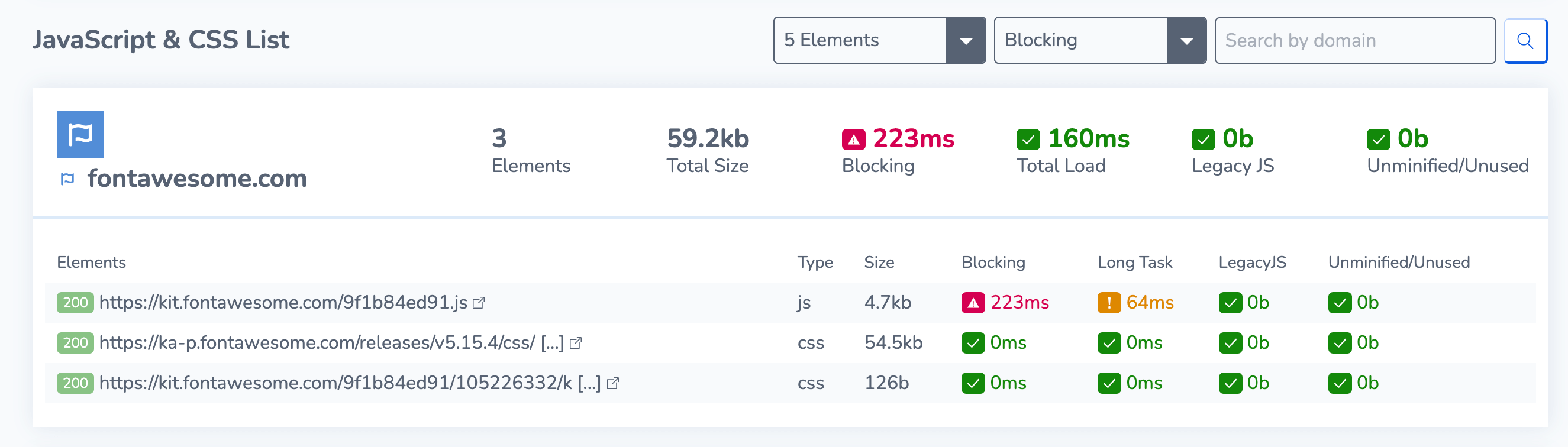
JavaScript & CSS
The JavaScript & CSS tab gives a Main thread breakdown so you can view which processes are taking the longest. This section also produces a list of all the JavaScript and CSS elements loaded by each of the origins present in the page load, giving a breakdown of the amount of elements, their size if they are blocking or a long task and if they contain any legacy JavaScript or are Unminified or Unused. Having this information means you can optimise your first party scripts but also audit the third party ones that might be causing performance issues.
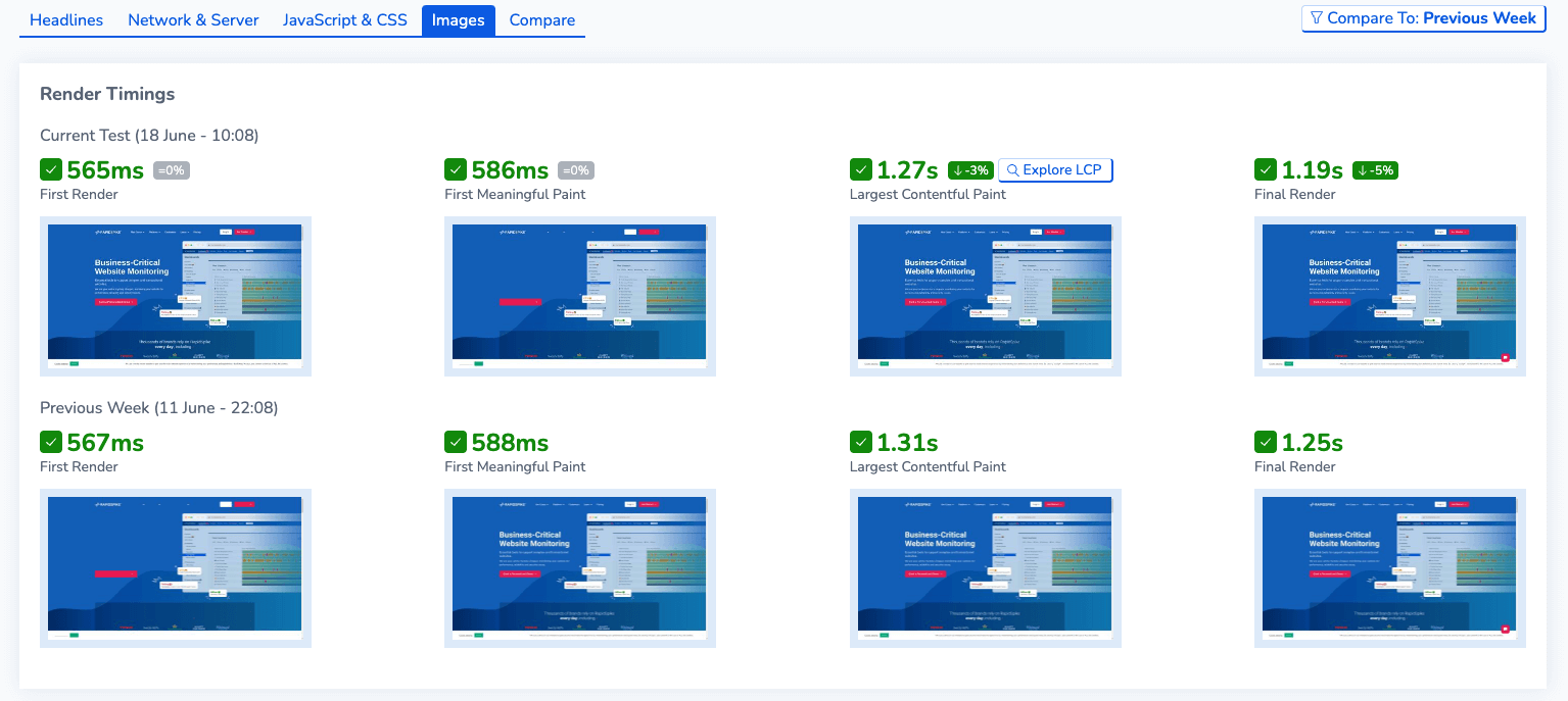
Images
The images tab provides screenshots of the website at each point of the four metrics outlined. Find out what the website is showing at each point of the metrics and compare values so you can see if there is any difference from the previous week or month for example.
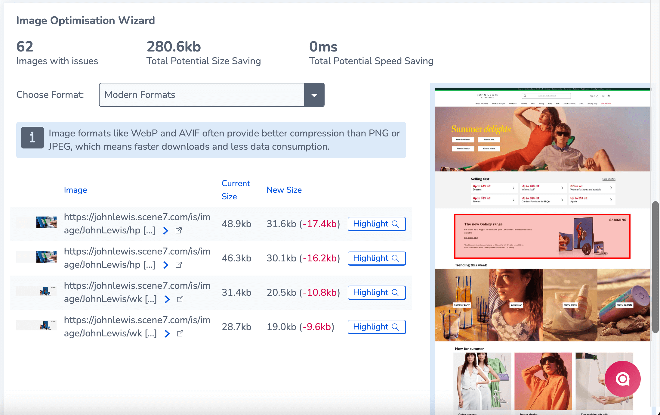
The images tab also contains the highly-anticipated Image Optimisation Wizard, this wizard shows any images from your site that have issues such as being old formats, offscreen or unsized and un-optimised images. Find out exactly how much you could be saving by optimising each image. From here you can highlight the images on the final screenshot to give you an indication which images on the page might be affecting performance.
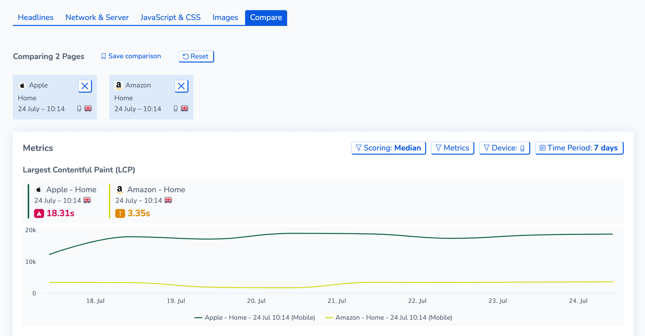
Compare
The Compare tab is a useful tool which lets users to take up to 4 tests from the current page you are viewing, or other pages from other sites you are monitoring, and compare the results of the tests.
This gives you an insight into which pages are performing better than others from comparing the metrics scores, to viewing their filmstrips all together to comparing the content breakdowns of different tests and pages. The comparison contains the main snippets of all the new performance dashboards.
We’re excited to share the new website performance dashboards with you to help supercharge your website monitoring. If you need any further assistance with the dashboards, please contact your Customer Support Lead or use our live chat today.