Today we’ve released a major update to the app that should help give a new perspective on your digital assets: the Overview page.
We’d always intended to display some sort of overview or aggregate view of all your monitors, but it’s taken a little time to get the new page ready. This is because we’ve been extremely focused on getting the granular views working properly – response graphs, events tables and so on. Now that these monitors are all up and working, and they contain all the vital stats that you need, we’ve turned our attention to the cover page for your asset.
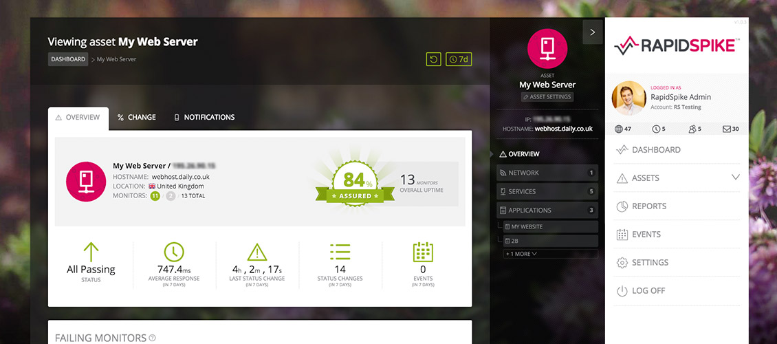
Your Asset’s Vital Stats
The new overview acts as the landing page when going to an asset via the dashboard or the menu sidebar. As a key dashboard it contains a summary of the asset itself – data you may have already seen in the sidebar – along with a few new facts and figures:
- We’ve added a lookup that determines your asset’s location according to IP address. Depending on the data available, it’ll give a city, region and country (along with a flag).
- We’ve listed the monitors on the asset, broken down by type (similar to the main dashboard).
- Most interestingly, we’ve also added a new ‘Assurance’ badge. This badge currently uses the overall asset uptime percentage. The badge changes (degrades) as your uptime decreases, so you’ll always be striving for that perfect 100%!
Below you can see the various states of the assurance badge – from rays of sunlight to storm clouds!
![]()
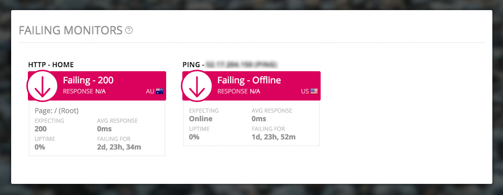
Showing your Failing Monitors
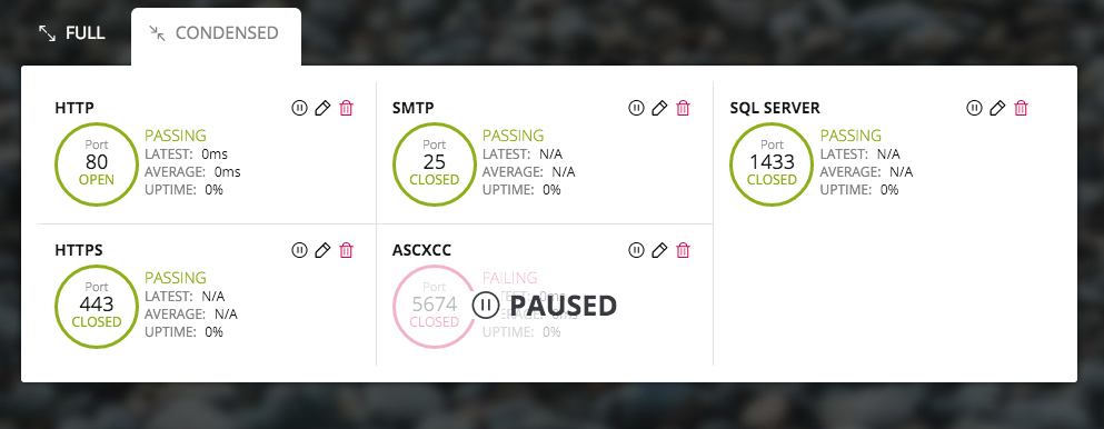
One of the most vital pieces of information RapidSpike provides is your current failing monitors. We’ve decided to list these on the overview so you can immediately see the health of your asset.
At the same time we decided to improve the way our monitors are displayed and add new information to make them even more useful. This new styling includes:
- Clearer status (larger arrow, block of colour)
- Improved ‘pause’ appearance
- Addition of the latest test result (status code, port status)
- Latest test location from our testing network (currently operating from three continents) – displaying a flag and country code.
We’ve also standardised the other metrics shown: the expected result, average response, uptime % and time since last incident. These changes have been rolled out to the Services and HTTP monitors so you’ll see the new style across the app. We’re pleased with the result – we think it’s clearer and more useful, providing extra information where its needed.
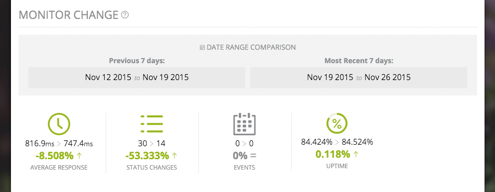
Tracking Change Over Time
The second tab on the new overview is Monitor Change – a brand new view that will show how your asset is performing over time. The time period depends on your current view – so if this is set to 7 days of data it compares the last 7 days to the 7 before that. Toggle your view to 24 hours, 7 days, 30 days and so on – and the tab will reload.
Each stat on this tab shows a percentage change and an arrow, which are coloured either green (good), grey (the same) or pink (bad) to indicate whether the trend is improving or getting worse.
Visualising your Notifications
Finally we have the Notifications tab, which shows all notification rules on your account (this has been moved from the ‘Settings’ page). More interesting is the Notification Visualisation below, where we’ve attempted to graphically represent how all the rules on your account will operate over a given 60 minute period. This should enable you to visualise at what point you or members of your team will receive their alerts, depending on the status of your monitors.
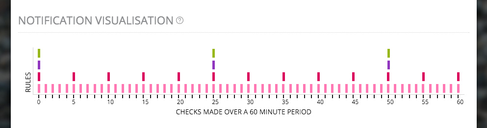
You can see at-a-glance the checks being made (which varies depending on your account level), and the rules currently applied to the asset. These rules are mapped out over the checks, so you can see when each might be triggered in a given 60-minute period.
We believe the new asset overview represents just another step in helping you manage your digital assets and making the RapidSpike app a truly comprehensive monitoring service. We’ll be adding even more new features in the coming weeks, so keep an eye on the blog for updates – and, of course, continue to send your feedback to info@rapidspike.com.