Eagle-eyed RapidSpike users will have noticed a big update to the app went live recently, with a major improvement to our Page Overview dashboard.
Going back to September 2020, when we launched “RapidSpike Version 2”, we had great plans for the Page Overview – but they never quite materialised. Team efforts were focussed elsewhere and we did little to improve the old Page Overview or the data we displayed. With good reason: we needed to make time for huge new monitors like Google Lighthouse and Web Vitals, a powerful new Reporting engine, plus countless dozens of other great features and updates.
Recently though we’ve been able to focus on developing an improved Page Overview, adding tons of new data points, trend graphs, filters and more.
What was wrong with the old dashboard?
Our old Page Overview lacked a number of key new metrics – including up to date stats from our new Web Vitals monitor and the Chrome User Experience Report that you find in PageSpeed Insights.
One other critical problem: it’s all well and good showing all data smooshed together, but sometimes when we are running monitors under different conditions, we need to see that information separately. For example, your Web Vitals stats will vary a lot from place to place, and when running on mobile or desktop.
Finally, we sought to improve something fundamental to the data in RapidSpike…
Data in context: a new view
We have developed a really in-depth monitoring solution and (I feel) we’re pretty good at delivering your results and data in an accessible way.
However, each test result is a snapshot in time – a single point on which you can make important decisions, but you might struggle to understand how it fits with the wider context.
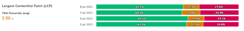
The “missing view” we needed to create was trending graphs that demonstrate how each of these test results fit together and show progress (or a lack of progress). We decided a perfect place to add these new views is on the Page Overview.
Your test results can all still be found in the usual places – however, the trend graphs you now see will be clickable, taking you to the individual results, and so tying the data together.
Adding Averages
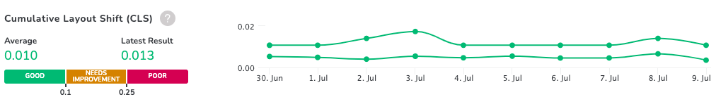
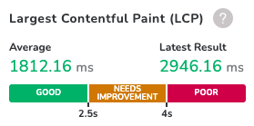
Sometimes you just need a single stat for a metric – be it your Google Lighthouse Performance, or your page render time. Previously when we presented data these stats were given just as your “latest” result. However this could present an inaccurate picture if your latest result was anomalous, or during off-peak times.
To improve how we report our performance metrics we have now provided an average result based on your current view (e.g. 7 days, 30 days, etc). This is simply an average of the total time of all completed tests.
Introducing Profiles
In addition to presenting data over time, we also have begun to address issues around data filtering by adding “profiles”. Profiles come from your monitors – and the options you have selected when setting them up.
So for example, a Web Vitals monitor you have configured to run on Mobile and Desktop and across three regions; London, San Francisco and Paris – will have each of these available in its “profile” menu on the Page Overview. You can then toggle on and off to see all the data, or just Mobile in Paris, or Desktop in London – for example.
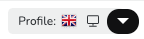
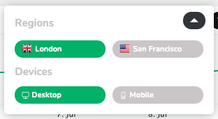
The Average and Latest results we display come from these Profiles – so can consider a profile as a way to totally filter all the information shown for that monitor.
Not all of the Page Overview monitors have access to Profiles yet, but this is something we hope to improve soon.
Splitting the data
RapidSpike is used by specialists to monitor a wide range of key website metrics. We recognise that often the data we present is used by totally different people with different roles – site reliability engineers, ecommerce managers, performance engineers, and so on.
Another thing we wanted to improve was what data we present and when. Tackling this, we split the Page Overview into two key tabs, Reliability and Performance – with data from all page monitors spread across both. The idea here is that if you approach the app with a goal in mind, e.g. solving reliability issues – you can do this from a single tab with all relevant data displayed.
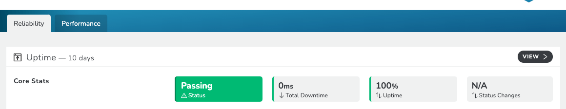
This also applies in Performance – quite a few of our monitors track Performance metrics as well as others. We tailored the view in RapidSpike to pull all the relevant performance data to the surface and display it in one place.
Looking to the future
We have a number of exciting future additions to the Page Overview we’re looking forward to sharing with you. A lot of what we’re attempting is to help present the amazing data in RapidSpike in the best way possible:
Some of this includes providing more of the same; more profile filtering, more config options, more stats where we have them.
Another way we hope to inform your data is by providing context – global averages, metrics from third party tools and more. We hope this will enable better understanding and decision making around what stats to work on, and where issues might have impacted one another.
We plan to add more in the way of threshold alerting for core metrics, which should help identify when problems are occurring.
And finally, there is also much more planned for remediation advice. We have our RapidSpike Insights which do a great job of flagging issues we recommend fixing (and how to fix them). We’d like to work on this to provide more in-depth knowledge, and make sure that your Insights are easy to find and understand, and that everything is linked up.
In Summary
We hope you find the updated Page Overview easy to use. We’re confident it can be a hugely valuable tool in monitoring and improving your site.
Get to the overview by clicking “Websites”, then by picking a site. On the site, just choose a page from the menu – the Page Overview is the first and main dashboard for each page.
Not signed up yet? Start monitoring your website today with a free 30-day trial.