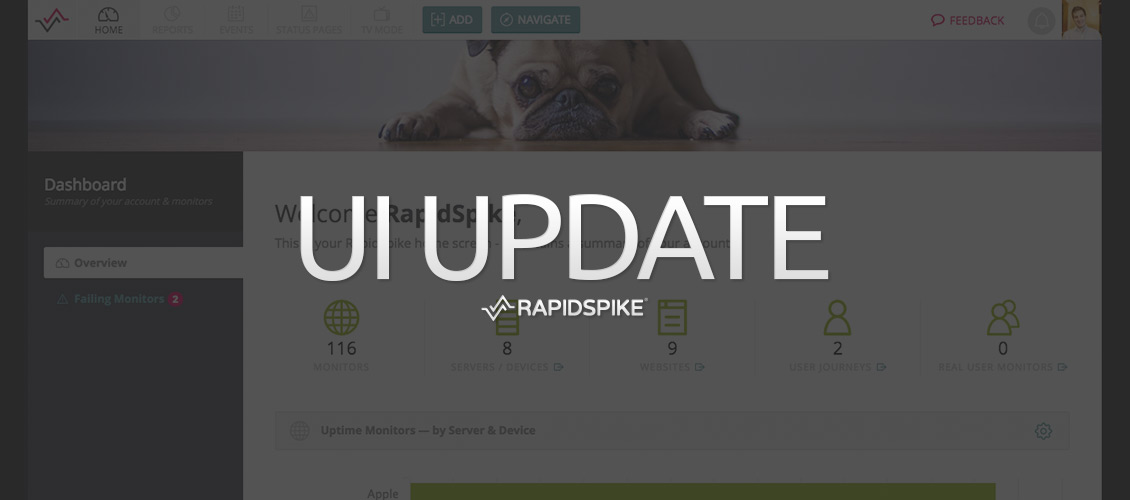
We’ve been hard at work on a redesign for our interface – the results have gone live this week. This post will quickly run through a few of our changes. We hope you find the new design a great improvement!
So what’s changed?
We’ve made a lot of improvements ‘under the hood’ to help with performance, as well as a lot of minor tweaks to help users navigate the app.
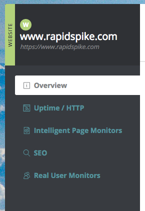
The first big change is to add a sidebar menu to most pages. As we add more and more tools to RapidSpike it has become increasingly important to keep the navigation as simple as possible. We need to make sure users understand where they are, as well as being able to find where they want to go next.
The sidebar does this job very well. Wherever you are in the app, the sidebar will show you the name of the section, along with any sub-pages or related pages in a simple menu.
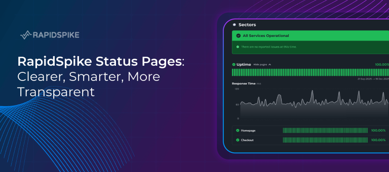
In the example above, you’ll see the Website sidebar. All the different types of Website monitors we currently offer can be found in the menu. Keep an eye on this space: as we add more and more monitors they will appear here (or in these pages).
Backgrounds
We’re very fond of the colourful and attractive backgrounds our customers can customise for the app. We feel that it makes using RapidSpike that bit more enjoyable than just a plain grey-and-white interface.
However I often found the old style of background made our UI look a bit “muddy” and grey. In an effort to fix this we have changed how the backgrounds work.
Depending on the size of your screen, you’ll now get an “app header image” instead of a full background. This means that the main content area (where your data, stats and graphs are) sits on a pure white background. It’s no longer a muddy grey – everything looks clean and fresh. Users with larger monitors will see a slightly different layout. The full screen background reappears, allowing you to make the most of the beautiful images we’ve provided.
To mark this change, we’ve also added a new set of photos to the range – why not go to your Account Settings and try them out?
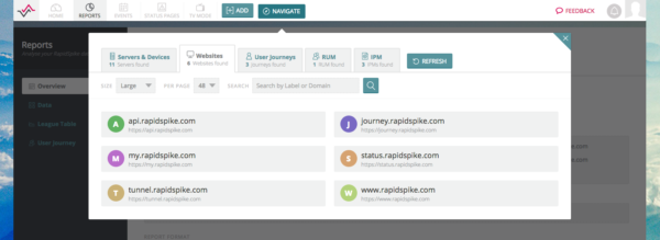
The old “Browse” menu item has been removed and replaced with “Navigate”. Why the change? We felt “navigate” was a better, clearer term for new users. We’ve also made a big change to how this menu operates and wanted a clean break with the old menu.
Navigate is a redesigned, cleaner and much-simplified version of the old menu. We hope it will be completely self-explanatory to new users how to get around in the app. Simply click the tabs at the top to show either Servers or Websites, or show some of our main types of monitors: User Journeys, RUM and IPMs. In future we anticipate new monitor types appearing here.
Clicking on a monitor type now takes you straight into the monitor in question with no sub-menus or extra clicks.
The main improvement to Navigate now means that it should be lightning fast, even on large accounts with hundreds of monitors. Its compact view allows you to show lots more items at once so we’ve increased the maximum number per page to 48.
Coming Soon…
These are just a few of the main updates we’ve made to the app. Not mentioned are hundreds of smaller changes and a fair few bug fixes. We also have plans for more updates in the coming months, including some improvements to our Add Monitor(s) window and other important parts of the user interface.
In addition, as ever we’ll be releasing new ways for you to monitor your online infrastructure, improved reports, and more detailed streamlined services.
Keep an eye out on this blog for our major feature announcements, as well as our regular update email. We hope you like the changes we’ve made this week and look forward to sharing the next with you soon.
As ever, if you have any feedback for the team please don’t hesitate to share it with us at support@rapidspike.com.