One of my biggest issues with the display of performance data in digital experience monitoring is using the “average” as the main value. Averages are of course useful in certain scenarios but when it comes to real user interactions on your website, averages are really unreliable.
What’s wrong with Average?
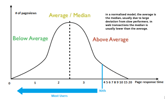
Averages are ineffective because they are too simplistic. What we need to understand is what the user experience is like for ‘most people’. There are always outliers affecting your average.
Take for example a user on a fast machine, with a fast browser on a fast connection versus someone on an old mobile phone, in another country over 3G, with an out-of-date browser. Both of these experiences are important (or perhaps not dependent on your viewpoint) but both are certainly very different and need to be assessed on their relative merits.
Improving on Average
The answer is Percentiles. Percentiles give you the ability to see what digital experience ‘most people’ are having when they hit your website. This removes the outliers – the unreliable 10%.
These outliers are unfortunately hitting your platform from places and platforms you may not care about.
Using real user data on page speed and digital experience is about taking immense amounts of data and looking at potential fixes to generate more revenue by fixing digital experience problems. Percentiles are a really great way of understanding the real user performance characteristics of your application.
Measuring Performance
With RapidSpike we measure performance in 2 ways:
Under controlled conditions using Intelligent Page Monitors (Chrome or Firefox). This is scenarios but page interrogation so you can understand your baseline digital experience. If this is a +3 second experience, you already have a problem.
In the ‘Real World’ using Real User Monitoring (RUM). RUM gives a situational understanding of how your baseline performs under real-world scenarios. It will always be worse because there are so many variables, you can only work towards
What real user monitoring percentiles can help to show you is:
- What is the experience like for most people?
- Which countries, devices and, platforms are you fast & slow?
- When are your best and worst times?
- How fast is your site when it is busy?
Breaking down the Percentiles
The 90th percentile is the start of the “digital experience tail”. It’s a lot more volatile, which means that slowness depends on specific behavior. This is quite often user demographics you might not care about. For example, users in certain countries or on mobile connections.
What’s important to understand is that the average is heavily influenced (dragged) by the 90th percentile. This means that a median is probably a better measure in the digital experience world if you are looking for a middle ground. As an example:
If the median (the top 50%) has a response time of 500ms that means that 50% of my transactions are either as fast or faster than 500ms.
If the 90th percentile of the same transaction is at 1000ms it means that 90% are as fast or faster and only 10% are slower.
The average in the case above could be: lower than 500ms (some really quick sessions); a lot higher (lots of really slow sessions); or somewhere in between.
A percentile gives a much better sense of your real-world
If you have a response time of 2 seconds at the median, and the 90th percentile is 4 seconds, you know that 40% of people have a performance degradation of almost double. This is definitely worth looking into, even if you don’t care for the 10% of the outliers. The other 40% could increase revenue and profit on your site by a considerable amount.
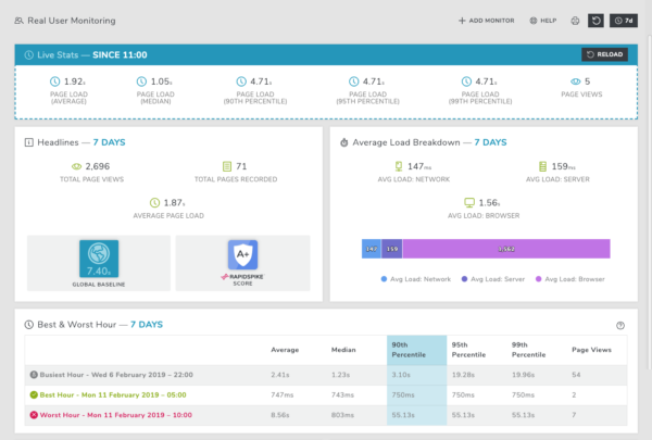
RapidSpike use percentiles to give you more specific information about your real user data. Percentiles will be shown on your Live Stats and Best & Worst Hour tools.